Why Mobile-First Design Is Essential for Modern Solar & Renewable Energy Websites
-
 Harshid Patel

The solar and renewable energy industry is growing rapidly in India and worldwide. More people want to switch to solar panels and clean energy solutions for their homes and businesses. When potential customers search for solar companies, most use their mobile phones. In 2026, over 70% of people browse websites on smartphones before making decisions. If your solar company website does not work well on mobile devices, you are losing customers to competitors. Mobile-first design means building websites that work perfectly on phones first, then adjusting for desktops. This blog explains why mobile-first design is essential for solar and renewable energy businesses and how it impacts customer acquisition and sales.
Why Mobile-First Design Matters for Solar Businesses
Solar companies need mobile-optimized websites to stay competitive.
People search for solar panel costs, installation services, and energy savings using their phones while at home or during commutes. They compare different companies and read reviews on mobile devices. By the time they reach a desktop, they have already shortlisted companies based on mobile experience.
Google uses mobile-first indexing, meaning it checks the mobile version of your website first for rankings. Solar companies with mobile-optimized websites appear higher in search results. Better rankings bring more organic traffic without extra advertising costs.
When customers can easily navigate your website and request quotes on phones, more of them actually contact you. Mobile-first websites see 30-40% higher inquiry rates compared to desktop-only designs. Every visitor becomes a potential customer when the experience is smooth.
Essential Mobile Features Solar Websites Must Have
Specific features make renewable energy websites effective on mobile devices.
Customers want to estimate solar savings and installation costs quickly on their phones. Mobile-friendly calculators should work with simple taps and show results instantly. Placing these tools prominently helps capture serious buyers immediately.
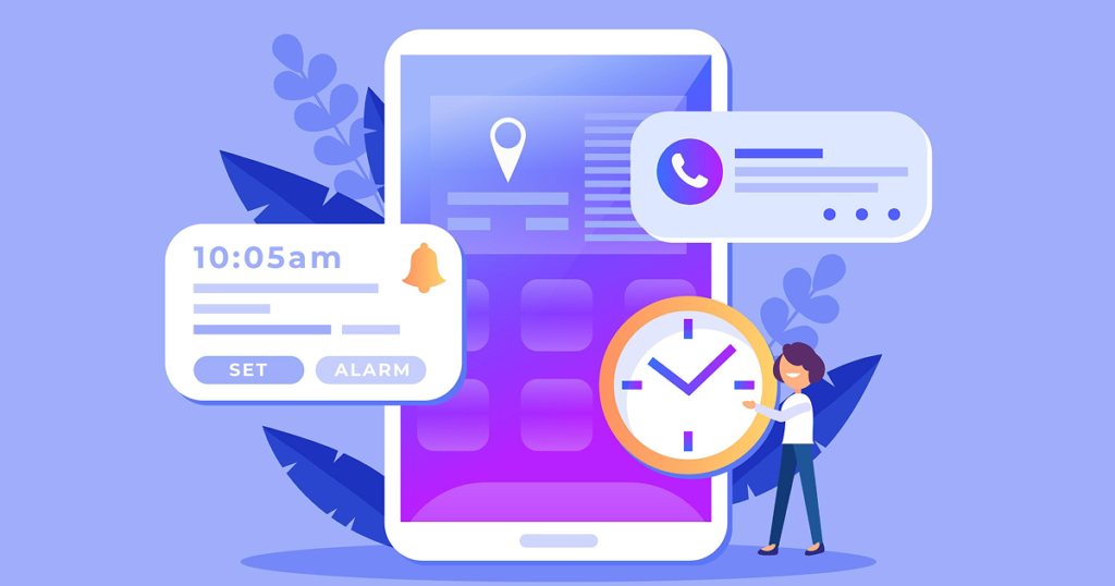
Visible phone number buttons that dial directly save customers effort. When someone is ready to talk, they should call with one tap. This simple feature often makes the difference between getting an inquiry or losing a customer.
Long forms frustrate mobile users typing on small screens. Mobile-first design uses shorter forms asking only essential information. Multi-step forms work better on phones than single long pages requiring lots of scrolling.
Common Mobile Design Mistakes to Avoid
Solar companies often make these errors that hurt customer experience.
Many websites use text sizes perfect for desktop but unreadable on phones. Font sizes should be at least 16px for comfortable mobile reading. Customers should not zoom in to read about solar specifications or pricing.
Mobile screens have limited space compared to desktops. Contact numbers, service areas, and pricing should be easily visible. Customers should not dig through multiple menu levels to find basic information.
High-resolution solar installation images look great on desktop but slow down mobile loading. Compressing images for mobile without losing quality is crucial. Every extra second of loading increases the chance of visitors leaving.
Impact on Customer Trust and Brand Perception
A smooth, modern mobile website makes customers assume your company is professional and trustworthy. Poor mobile design makes people question if you can handle complex solar installations. First impressions matter greatly in renewable energy business.
Companies investing in good mobile experiences demonstrate they care about customer convenience. This builds trust that you will provide good service after installation. Customer-focused design indicates customer-focused business practices.
Having a mobile-friendly website is a basic expectation in 2026, not a luxury. Solar companies without mobile optimization appear outdated compared to competitors. Customers naturally prefer companies that keep up with technology trends.
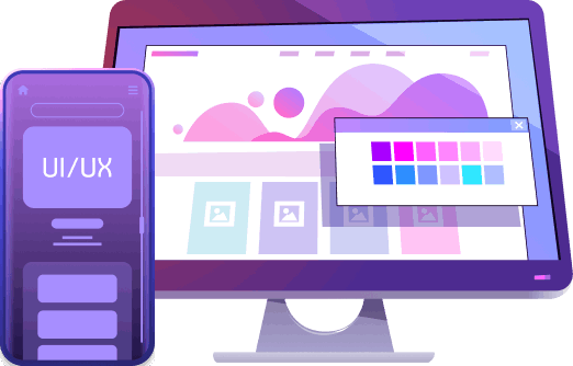
Technical Elements of Effective Mobile-First Design
Responsive websites adjust layout based on screen size without separate mobile versions. Content reorganizes to fit perfectly on small phones or large desktops. This approach saves development time and ensures consistency.
Mobile users tap with fingers, not click with a mouse. Buttons need to be large enough to tap easily without hitting wrong elements. Proper spacing between clickable items prevents frustration.
Every image should be compressed to load quickly without looking pixelated. Modern formats like WebP reduce file sizes by 30-40%. Smaller files mean faster loading even on slower networks.
How to Transition to Mobile-First Design
Test your website on different mobile devices to identify problems. Check loading speed, readability, form usability, and navigation ease. Google Mobile-Friendly Test shows specific issues needing fixes.
Start by planning how everything looks on a phone first. Once mobile design is perfect, expand it to larger screens. This ensures mobile experience never gets compromised for desktop features.
Companies like ngendev technolab build mobile-first websites specifically for solar businesses. They optimize solar calculators, installation galleries, and inquiry forms for mobile users. Professional development ensures smooth performance across all devices.
Conclusion
Mobile-first design is essential for solar and renewable energy companies in 2026 because customers search and make decisions on mobile phones. Websites working perfectly on phones capture more leads, rank higher on Google, and build stronger customer trust. Solar companies using desktop-focused websites lose potential customers daily to competitors with better mobile experiences. Simple improvements like faster loading, larger text, easy forms, and click-to-call buttons make real differences in conversion rates. Investing in mobile-first design pays back quickly through increased inquiries and installations. Solar businesses ready to grow must prioritize mobile experience to succeed in the modern digital landscape.
Frequently Asked Questions
Mobile phones are always available, making it convenient to search for solar options anytime and anywhere. Customers research during breaks, commutes, or at home without sitting at computers. Mobile allows quick comparisons of multiple companies easily.
Mobile-optimized websites make requesting quotes, using calculators, and contacting companies easier. When the process is simple on phones, more visitors become customers. Companies report 30-40% more inquiries after switching to mobile-first design.
Yes, existing websites can be redesigned with mobile-first approach without starting from scratch. Developers audit sites, identify mobile issues, and rebuild layouts prioritizing phone screens. The process typically takes 6-10 weeks.
Treating mobile as an afterthought by simply shrinking desktop designs creates poor experiences. This results in tiny text, difficult navigation, and slow loading. Building for mobile first and expanding to desktop prevents these problems.
Ngendev technolab is an experienced website development company that builds mobile-first websites specifically for solar and renewable energy businesses.
Get Free consultation and let us know about your custom web and Mobile App project idea
Over 14+ years of work experience, we have built 210+ web and mobile apps
We can help you with
- Dedicated Developer
- delivering high-quality development
- Custom Mobile App Development
- Innovative Solution For Startups and Enterprise
Latest Blogs
Explore the Latest Blogs on Trends and Technology.